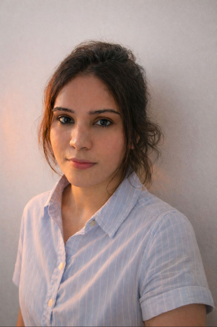
Hey, I'm Kritika.
Product Designer · UX Researcher · UI/UX Designer.
Curious by nature, designer by choice. I turn "why doesn't this work?" into "this feels right" - crafting unforgettable, immersive experiences that are both usable and delightful.
My design isn't restricted to digital interfaces.
I design systems, services and physical experiences - transcending the boundary of digital & physical, speculative & practical, working with versatility toward solutions people actually use.
Explore how I tackle complex problems
{{ t.quote }}
Let's build
something exceptional.
Work.
A selection across product design, research and side explorations - engaged separately, or as one practice that takes a problem from field research to shipped product.
I'm a designer who treats every product like a system to understand before it's a screen to draw.
I'm Kritika Sharma - a product and UX designer based in India, working across fintech, healthcare, security and service design. My practice sits at the intersection of research and craft: I dive deep into the core of a problem, understand real user needs, and translate complexity into clear, usable, sometimes delightful solutions.
I've led end-to-end product discovery and design for fast-paced financial environments, designed branding and apps for new ventures, and contributed to academic research on cross-cultural design and low-power display typography. I work fluidly between digital interfaces, systems, services and physical experiences.
{{ a.title }}
{{ a.body }}
Trading
Terminal.
A unified, keyboard-first terminal that lets active traders watch markets, size positions and execute orders without ever leaving the screen - designed to stay calm under volatility.
Active traders were stitching together four to five disconnected tools to watch markets, size positions and place orders. Context-switching cost them seconds that matter, and a cluttered, inconsistent interface produced costly mis-clicks during volatile sessions.
One keyboard-first terminal: customisable watchlists, a one-key order ticket, real-time risk and P&L always in view, and a deliberately calm visual hierarchy that holds up under pressure instead of adding to it.
Faster, more confident execution and fewer erroneous orders directly protected revenue on every session, while smoother onboarding and higher daily engagement grew the active trader base - turning the terminal from a cost centre into a retention driver.
A desk that ran on muscle memory and luck
The team ran a high-frequency retail and pro desk where traders moved fast across equities and derivatives. The existing setup was a patchwork: a charting app in one window, a broker's order panel in another, a spreadsheet for risk, and a chat tool for the desk. Nothing shared state.
I joined as lead designer to take the product from this fragmented reality to a single terminal - owning discovery, IA, interaction design and the visual system, working daily with engineering and the trading floor.
I sat on the floor before I drew a pixel
Discovery combined contextual ride-alongs during live market hours, in-depth interviews with eight traders across experience levels, a teardown of six competitor terminals, and analysis of error logs from the existing order panel.
Four truths that shaped every decision
{{ i.title }}
{{ i.body }}
One screen, three zones, zero window-switching
I restructured the workspace into three persistent zones - market context (left), live chart and depth (centre), and action + risk (right) - so a trader's eye path matched their decision path. Everything a trade needs is reachable without leaving the keyboard or losing the chart.
A visual language tuned for split-second reading
Dense data needs restraint, not decoration. I built a tight type and colour system: one monospace family for perfect numeric alignment, a strict semantic palette (green long, red short, amber risk), and a density scale that lets traders compress or expand rows without losing hierarchy.
Colour was rationed deliberately - used only where it carries meaning - so a flash of red always means something and never just decorates.
The keyboard is the fastest mouse
Every primary action got a single-key shortcut and a confirm-before-commit safeguard sized to the order's risk. Small orders flow instantly; outsized ones surface a deliberate, unmissable confirmation - friction placed exactly where it prevents loss.
Measured on the floor, not in a deck
Twelve weeks after rollout, we re-ran the task benchmarks with the same traders and compared order logs against the old setup. The system didn't just feel faster - it measurably reduced errors and lifted engagement.
What I'd carry forward
Designing for experts meant unlearning the instinct to simplify. The win wasn't fewer features - it was the right information at the right density, with friction engineered precisely where risk lived. Watching a trader place a clean order without looking down at the keyboard was the real proof.
Next, I'd push into customisable layouts per trading style and a learn-mode that lowers the floor for new joiners without slowing the veterans down.
Beyond
Speech.
Designing for continuity - a dual-pathway speech-rehabilitation system for dysarthria, built for low-literacy patients in limited-resource public healthcare.
Dysarthria therapy runs for months to years and leans on weekly hospital visits. In limited-resource government hospitals - serving low-literacy, Hindi-speaking, economically backward patients - overcrowded OPDs, exhausted clinicians and long travel make continuity nearly impossible. Dropout peaks in the intermediate phase, when novelty fades and recovery hasn't yet arrived.
A dual-pathway system with the speech-language pathologist at the centre, designed to cut hospital visits from weekly to monthly while preserving clinician contact. Pathway A - a low-tech, print-friendly home workbook. Pathway B - an AR-assisted, gamified app with on-device oral-motor recognition and "Gaju," an emotive guiding mascot.
Continuity of care without dependence on constant hospital access - lowering dropout, easing clinician load and travel burden, and meeting patients exactly where literacy, connectivity and resources are scarce. Care that works through interdependence, not just inside institutions.
The full capstone, on one wall

Not a research question - a lived rupture
The most honest place to begin this work was not a hypothesis but an experience. A traumatic period left me with functional dysarthria - not neurological, but enough to make speech effortful, hesitant, isolating.
A relative with ALS lost speech progressively, until they could no longer communicate even basic needs. Those two experiences sit underneath this entire project - the same condition that, in a familiar context, affected Stephen Hawking.
The mind knows. The body struggles.
Dysarthria is a neuromuscular speech disorder: neurological damage weakens the muscles that produce speech. The distinction that anchors the project - language is intact; the mechanics of producing sound are impaired.
MAYO / FDA
Systems become visible when they fail
Field observations across government hospitals in Delhi: hours-long OPD queues, overwhelmed reception staff calling names by hand, an SLP working from a tiny room with minimal resources and no digitised records, and patients shuttled between departments in the heat. The infrastructure of care was quietly breaking under load.
The work is grounded in disability-justice thinking - Star & Bowker on infrastructure, Piepzna-Samarasinha and Mia Mingus on care webs and interdependence: care should exist beyond institutions, and healing works through interdependence.
Three patients, three different stakes
{{ a.title }}
{{ a.body }}
The gap where novelty fades and recovery hasn't arrived
Therapy spans months to years. The steepest drop-off lands in the intermediate phase - roughly the second and third month - when the newness has worn off but visible recovery hasn't yet begun. That window is exactly where continuity has to hold.
What design intervention could reduce hospital visits from once a week to once a month - lowering therapy dropout while preserving clinician–patient interaction - for low-literacy, Hindi-speaking and economically backward users in a limited-resource government hospital?
Eight probes, with caregivers and SLPs
Rather than design for these users, I designed with them - testing eight probes across the low-tech to high-tech spectrum to learn what actually earned daily practice.
{{ i.title }}
{{ i.body }}
One plan. Two pathways. SLP at the centre.
The same therapy plan reaches the patient two ways - chosen to fit their literacy, devices and connectivity - but both route back through the speech-language pathologist at the monthly visit, so oversight never breaks even as visit frequency drops.
Home-based therapy workbook
AR-assisted gamified app
Communication is not only the ability to speak. It is the ability to remain connected.
{{ caseTitle }}.
This case study is being written up in full. The Trading Terminal and Beyond Speech studies are live - explore those while this one comes together.